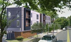
Here’s more information on the new three-story building under construction in the triangle between Cedar and Baltimore Avenues, the former location of the Philadelphia Credit Union. Construction of the mixed-use structure, which will include six residential units and a commercial space on the ground floor, began in the summer and is expected to be completed in late spring 2016, according to Philly Curbed.
As was reported earlier, the lot belongs to the Lai family, who own several businesses and other properties in the area. An appeal was filed against the Philadelphia Board of Licenses and Inspections earlier this year, on the grounds that they “did not consider the impact of adjacent property with regard to air, light and use impairment” when issuing the building permit. The affected property was not mentioned. The appeal was denied last month, and the construction at 4610 Cedar continues. Check out more renderings and photos on Curbed.


December 3rd, 2015 at 6:51 pm
I wonder which property tried to stop this 🙂
December 3rd, 2015 at 7:38 pm
Click through the link in the Curbed article to one by UC Review. The same annoying person who prevented other things opening up – the immediate neighbors DeBorah Giles.
If she had let other businesses open at the space she wouldn’t have to contend with a three story building that affects her light and air.
I’m hoping for a great Italian BYOB or sushi restaurant on the ground floor.
http://ucreview.com/possible-wrinkle-in-development-at-cedar-avenue-p5767-1.htm
December 4th, 2015 at 4:06 pm
hahaha, light and air appeal. that neighbor is a joke
December 5th, 2015 at 7:47 pm
I noticed on my own that the structure completely blocks at least one of the windows on the adjacent building, which, if that is the “light” concern, would not be a frivolous complaint.
December 7th, 2015 at 10:38 am
Too bad the design does not incorporate any of the neighborhood’s Victorian charm. It looks a little out of place, but worlds better than what was there. Looking forward to the some new shops and restaurants!